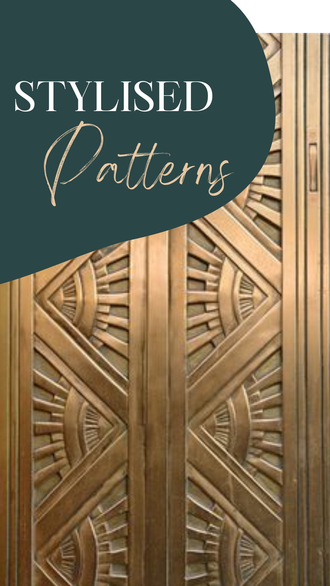
Elegance of design simplicity – repetition, colour and line quality are key

Stylised Patterns
To create stylised patterns simplicity and repetition are often the foundation for stunning patterns. Patterns, when simple and geometric, can be so striking. Colour choices or black & white – the quality of the line, or the smooth transition from one shade to another, all form inspirational patterns. This selection of patterns range from cushion covers to a New York bronze door. It seems art deco, gold and teal are part of the appeal for me. If you would like to see more examples of stylised patterns see @jewelsgalore4u. Which is your favourite?

Stylised Colours and Curves
When looking at these five stylised patterns I find the subtle changes are the foundations of the simplicity. The gradation from a thin line to a thick line – the variation between the colour and the background slowly swapping place – the elegant selection of curves – the curves and lines that turn a radiating sun into repetitive triangles with a life of their own. If you’d like to know more about what your colour preferences say about you see part 1 and part 2.

Pattern Practice and Progress
One thing I’ve found about simple, elegant design is that it can take a while to reach that stylised elegance. Variations in the lines, colours, curves and all impact the final effect. If these aren’t in sync the feeling of simplicity is not reached. The colour selection, the shading effects, the medium used and the combined effect of all these choices will all impact the design. I’ve heard it said that with every additional feature on a car another customer is lost. A feature that will catch the eye and be a repellent, rather than appealing. An example of why simplicity and elegance are important. Here’s a link if you’d like to see more about what Modern Day Magic is for you.

Artists Acknowledgements
These stylised patterns are by: 1 Blue and Grey cutwork cushion cover from Koala Living, 2 Velvet cushion with glossy Art Deco print from Westwing Now, 3 1 of 700 patterns from Vertigogrphx Patterns, 4 In Love with Japan wave pattern from tumblr and 5 Art Deco bronze door detail in New York from istock by Getty Images.

What is that brings stylised patterns together for you?

