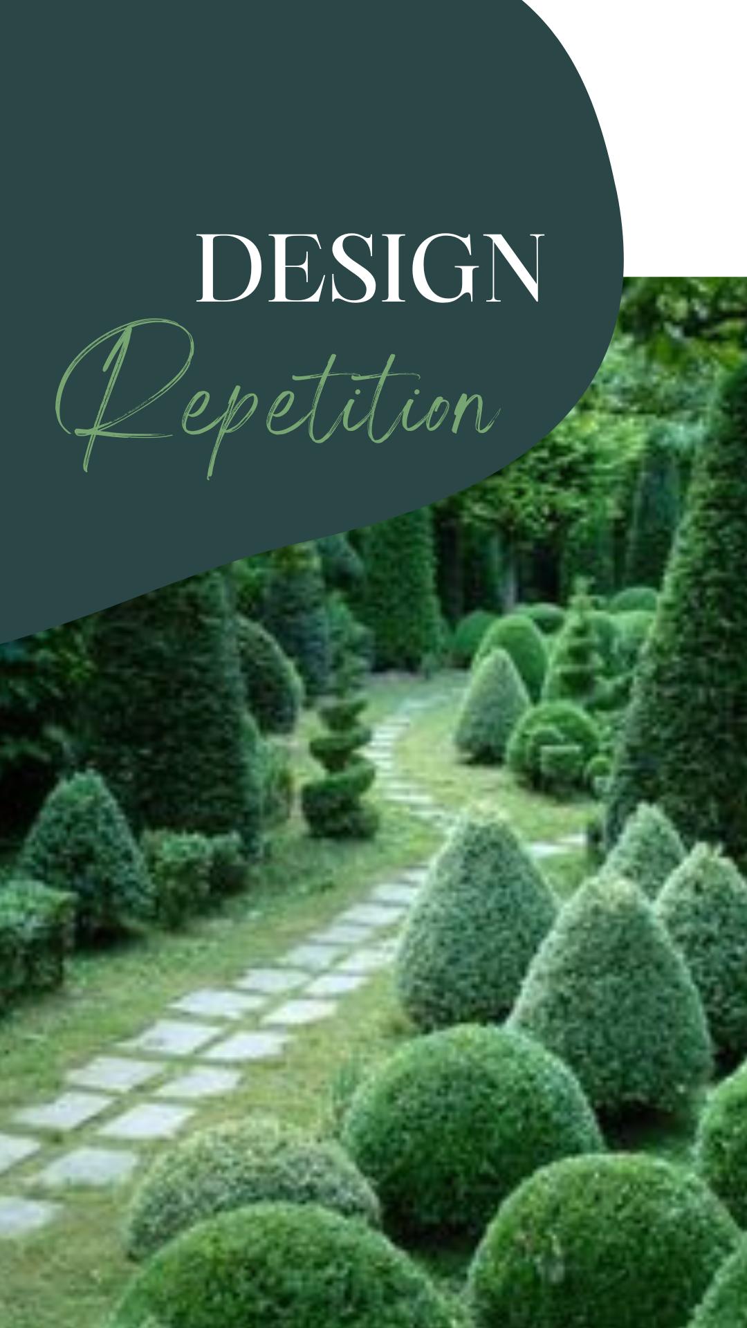
Why Repetition in Design is so Effective. Try It Out.

Repetition in Design
Repetition and familiarity are closely related in design. Their connection is why repetition in design is so effective.
Familiarity is the state of knowing something well; the state of recognising something.[1]
It is this state of familiarity that draws us to something. We recognise it, know what to expect and accept it. This is why repetition works. Repetition draws our attention and we feel comfortable with the aesthetic.
Nature is the master of repetition. There are wonderful examples of repetition used by so many designers. Architects over centuries have applied it. Artists like M.C Escher and Cyril Power exemplify repetition. Garden designers integrate repetition with magnificent effect.

Gareth David has written a great article on repetition in graphic design.

Some of my favourite repetition includes:
Nature
- Fern fronds – “Art Forms on Nature 55” Fern fronds photo by Karl Blossfeldt
- Poppy seed pods photo by Cheryl Rose
Garden Design
- Garden Design – source unknown
- Wollerton Old Hall Garden see wollertonoldhallgarden.com

Artwork
- “Sky and Water I” artwork by M.C.Escher
- “The Eight” artwork by Cyril Power

Architecture
- Bussaco Palace columns article by Jane Canapini
- San Pellegrino Factory & Headquarters Italy

As you can see from these examples repetition can be ornate or simple. Regardless of which the effect is beautiful.

Experience For You
As I’m interested in giving readers’ experiences here’s something for you to apply to your latest project.
1) Find an example of repetition from nature. For example leaves, seed pods or flowers.
2) Recreate it in a drawing or design.
What did you notice about the repetition in nature? How did you apply repetition in your design?

Applying repetition
A photographer who
- captures patterns from architecture
- chooses to shoot black and white photos
- selects one subject to photograph
An illustrator who
- draws architecture
- has found their style
- picks a medium to express their creativity

Architecture
- Apartment building photo by Juan Ignacio Pascual
- Cloisters in Portugal photo by Dmitry Shakin
- The Dragon Skin Pavilion Hong Kong
The Dragon Skin Pavilion was a highly experimental temporary structure designed from 163 unique pieces of plywood.
Let me know what you love about repetition in design.
For more on Elegance of design simplicity here’s a link.
[1] https://www.oxfordlearnersdictionaries.com/definition/american_english/familiarity

